
A couple of you have asked me how I go about making art from my prints--well actually, it's nothing new or different. I know a lot of artists use their prints to use in many different forms (ie. clothing, ceramics, jewelry, etc. and even boxes ; ), but I like to take them and make all new art pieces. This comes in handy when you don't have a lot of time and you need to produce (like the last 2 weeks, for example) Here are a couple of pieces that I just made last week, and they really didn't take that long. These are my original garden girls that I posted in the beginning of the summer--


So I decided that I wanted to do something with these 2. And when I make copies, I don't go to a copy place or anything. I just print them out on my printer. I am no expert when it comes to any of this stuff, especially printers. I just know that I love mine, and the copies are pretty true to the color--a little different, but no one would know that, except me. Also, I don't scan any of my art ( I don't think I've made anything flat enough to fit in a scanner, to tell you the truth) I just take a lot of photos everywhere I can find good light--inside and out until I'm happy with the results. My printer is a Canon MP600, which means nothing to me--I just know that it produces good resolution--listen to me--acting like I know what I'm talking about. And I do love my camera. It's a Sony Cyber-shot--not the best, but still pretty good. I'm actually hoping to upgrade soon. And before I printed them out, I decided to fool around with the color a little bit. I wanted the color a bit more muted.
.JPG)
.JPG)
What I did was fool around with the saturation (this is on my program from my Sony camera)--I just took out the brighter colors and their skin tone. The girl on the left is now a brunette.
And what I decided this time was to look for co-ordinating papers that would compliment these. 

On this one, I also printed out another piece of my artwork (the houses) Those houses were from the one table that I made. I found, with my camera, that instead of cropping photos, it's better just to take a lot of close up shots.
I like to print out my art on this card stock that I get from Staples (office supply store). It's nice and thick--110 lb. I use the cream color, but there are many color choices there, and of course you can just use white. And when I want to decrease the size of the photo, I usually use the Windows program that is free if you have Windows, and everyone does if they have a PC. The program is called the Windows Picture and Fax viewer, and it gives you 5 different size options. And if I don't want to us those sizes, I just use my printer program on my computer to decrease the size of the photo that way. (I hope I'm not confusing anyone even more)
This first one was completely inspired by Teresa Magel. She is now one of my favorite artists. I first found out about her when Lisa from The Wright Stuff blogged about her and some other artists. I adore her faces, and how she uses them in her mixed media collages--in this fashion--

I also wanted to tell you that the way I adhere the images onto my surface is with gel medium and then cover it also with that or matte medium. And yes, the colors run a bit, but not much, and I really like the smudgy, shabby look, so that's good for me. But I have sprayed a workable fixative on the copies, which keeps them from running. On these, I didn't do that.
I wanted to put my own style into this piece also, so I put the collage on 2 1/2 inch wrapped canvas--this was one measures 9 x 9. These are so cool--they look like hanging boxes.


I stenciled these on with Golden's light molding paste, and then just painted them.
And I used a cupboard door face plate also using Basic Grey glazed brads to attach it to the canvas.
 Plus the coffee-stained doily. How I adhere these doilies or lace or any material for that matter, I do it with matte medium, and cover it with the medium also, and in this case, I used a very watery acrylic wash of paint in random spots. And then I just seal it up with the rest of the piece. Lately, I've been on a shiny kick. I would always seal everything with a satin finish sealer--now I've been using a gloss varnish on everything. It covers the fiber very nicely--it adds a great texture to the doily--almost like sculpture.
This first one was completely inspired by Teresa Magel. She is now one of my favorite artists. I first found out about her when Lisa from The Wright Stuff blogged about her and some other artists. I adore her faces, and how she uses them in her mixed media collages--in this fashion--

I also wanted to tell you that the way I adhere the images onto my surface is with gel medium and then cover it also with that or matte medium. And yes, the colors run a bit, but not much, and I really like the smudgy, shabby look, so that's good for me. But I have sprayed a workable fixative on the copies, which keeps them from running. On these, I didn't do that.
I wanted to put my own style into this piece also, so I put the collage on 2 1/2 inch wrapped canvas--this was one measures 9 x 9. These are so cool--they look like hanging boxes.

I also added my extra collage elements on like these roses--

I stenciled these on with Golden's light molding paste, and then just painted them.
And I used a cupboard door face plate also using Basic Grey glazed brads to attach it to the canvas.


I'm never sure how these collages will turn out, but I was loving this one every step of the way! And as far as the printed image, once it's collaged on and all dry, I always add color to the eyes and lips, and use a fine point pitt pen to bring out details in the eyes, nose and mouth. Sometimes I'll do more with the hair and skin-tone, but not on this one or the other one either.
And speaking of the other one, I decided to keep her face whole and combined it with this scrapbook paper with the bird image--they went well together.
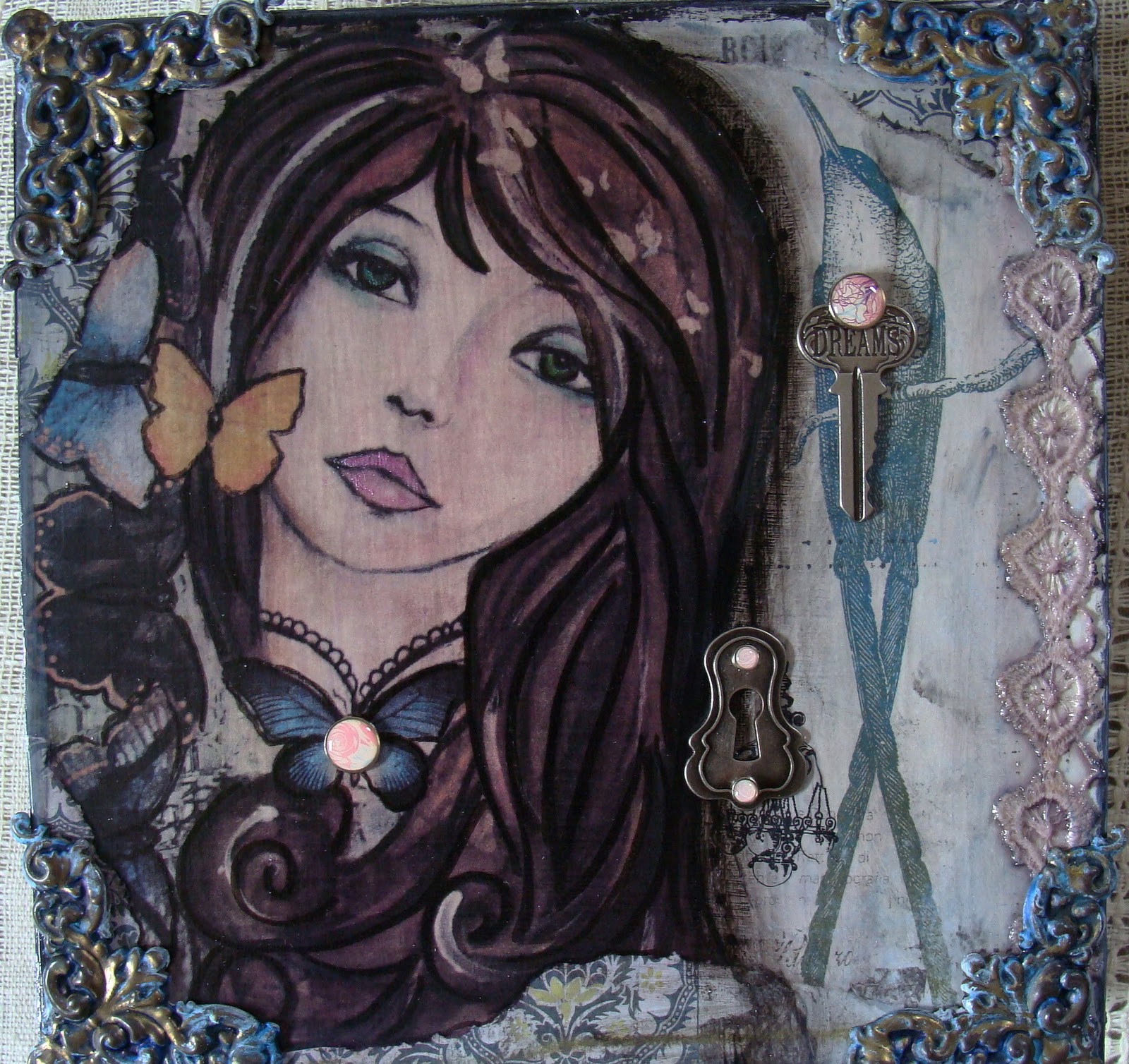
And on the sides is where I put some of my house prints on--

I really liked the brass corners that I added. These corners were completely black when I started out with them. So I cleaned them up, but they didn't clean up very well, so I first put some Amaco antique white rub'n buff on them and then some Blue Stream Alcohol ink over that, which was very intense. So then I just rubbed a lot off with 91% alchohol, and it brought some of the shiny brass out--
 ----exactly what I was going for!
And a big Thank You to Tim Holtz and Basic Grey for these very cool embellishments--

So in the end--these are prints of my art, but yet still original art pieces-


This is only one way that you can print out your art. Another way is with Lazertran Transfer paper for inkjet printers (they also have it for laser printers too). Lazertran is decal paper. Once you print your image out on this paper, you soak it no more than a minute in water and it slides right off, and it's a bit transparent. But you can make it really transparent if you follow the special directions that come with the Lazertran papers. I have yet to do this, but I've printed out on Lazertran before. I use it sparingly, because it's costly. Or I have tried printing out on scrapbook papers also. This you have to fool around with, because it doesn't always look good. As I experiment with new ways, I'll be sure to post them. And if I missed anything about how I do this, just ask me!!
And one more thing--I want to thank Regina from RGR Designs for this--

